In the last post, Charting historical record high temperatures: Part 1, I wrote a plan and light technical specification to outline a project to chart record high and low temperatures in a dashboard for a given location as well as other record breaking weather events. Since I wrote that last post I’ve put together a stable MVP React front end.
Challenges
One of the biggest challenges in creating this dashboard has been to find a reliable data source to use. Specifically, one that is constantly being updated without any work on my part. In my research I came across a few exportable data sets, but in order to use those data sets I would need to create an automated process to export the data, import it into a usable back end like a database or GitHub repo and then write an API to serve the data to my React front end. Hence, finding something already automated would be optimal for this project.
I found the RCC-ACIS web services that are pretty extensible and give me the exact data needed for the dashboard. There’s not a ton of documentation available for the API – other than some examples on the web services page – so building the queries has been a little bit of trial and error. There are a couple different query builders that have been helpful in creating the different queries and post requests that I need to return the right data. One of the hardest parts so far has been trying to figure out the API and the different variables available in order to get the right data returned.
At first I was just going to create this dashboard for Minneapolis, but after seeing the RCC-ACIS API I saw that I could access all the weather stations across the United States. Now there are two drop downs on the front end for the user to choose a state and weather station area. The weather station area drop down is a subset of the weather stations for the selected state. Because not all the weather stations available have continuous data coverage, I had to use ThreadEx stations or stations that combine data for a given area. TheadEx stands for Threaded Extremes which are stations that take weather data recorded at National Weather Service Automated Surface Observing Stations and merge it together with other nearby data to create a single data set of weather information. To learn more about ThreadEx, visit the project background page.
Another challenge has been the request to the StnMeta endpoint to return the list of stations for the selected state. When a user selects the state the app sends a request to a station meta data endpoint. This request is quite a bit slower than all the other requests to the API because it’s returning every possible station available for the selected state. After the data is returned I then trim down the results to only return the ThreadEx Areas. The next step to avoid this delay is to put every ThreadEx Area station into a local .json file that gets bundled with the app, dramatically increasing the station drop down load time.
What I’ve built so far
Record temperatures for a selected date
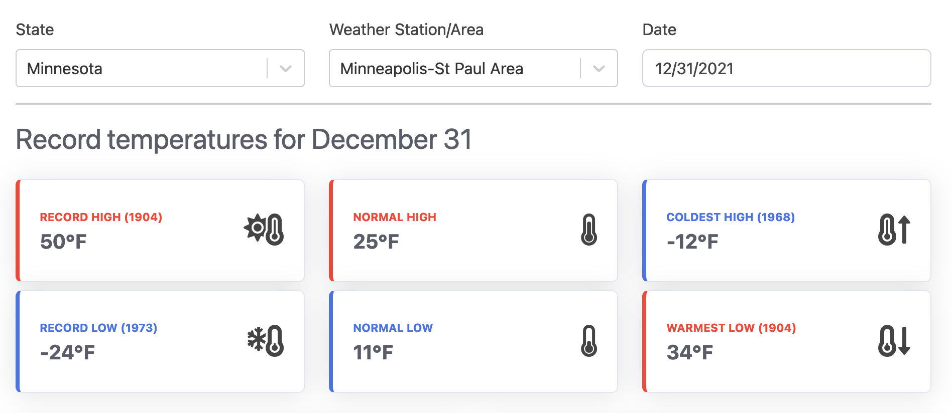
The first section of the front end contains six different components that display record high temperature, low temperature, coldest high temperature and warmest low temperature records. The other two components are normal high and normal low temperatures to compare the records to.
All time record highs and lows for a selected date
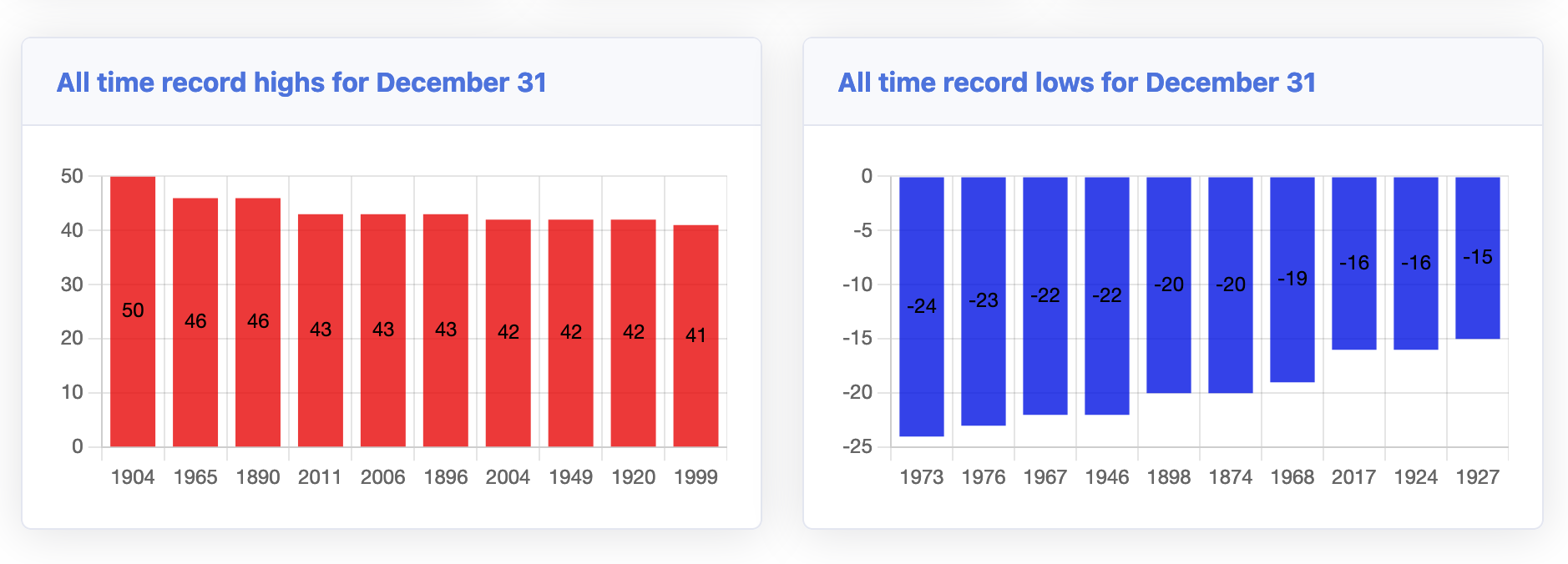
In addition to the record high temperature for the selected date, the next section shows the all time record highs and all time record lows for the selected date. By default the order is from highest/lowest record first and down the array from there. At first I had the records ordered by date so that you could easily see if there was a pattern developing but in the end decided I liked highest to lowest was more visually appealing.
Monthly temperature trends for a selected date’s month
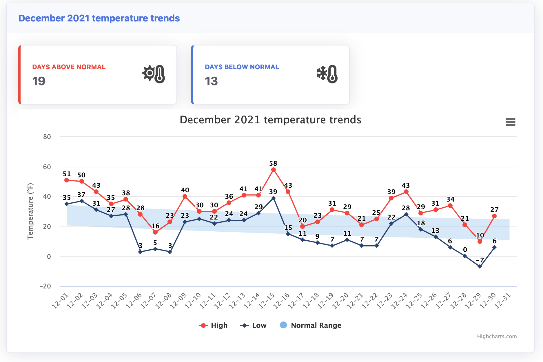
After the top ten record highs and low temperature charts, the section that follows is for the selected date’s month temperatures. This section displays the number of days the high temperature was above the normal high and the number of days the high temperature was below the normal high. Then the chart displays the high, low and normal temperature range for each day of the month. High and low is month to selected date, while normal range goes through the entire month.
Snowfall for selected date’s season
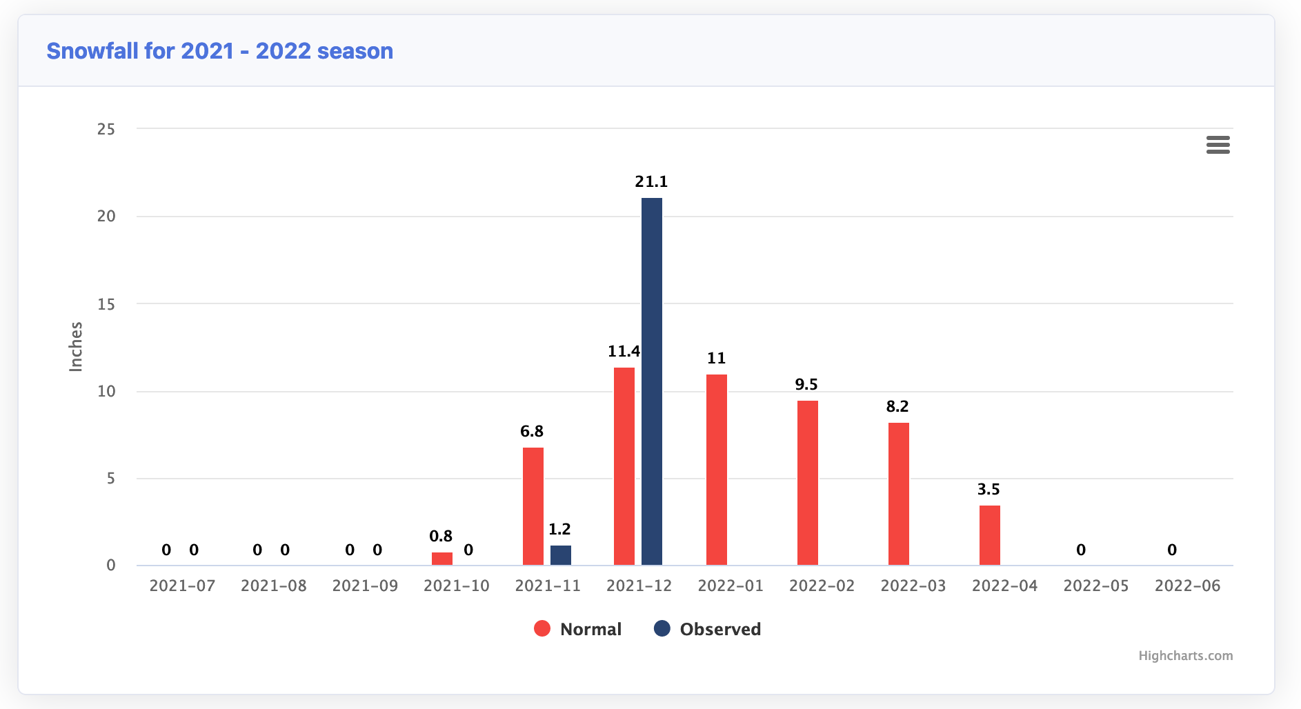
Finally, this week I was able to get the chart to display the snowfall for the selected date’s season. The normal snowfall numbers per “year” are not calculated January through December like precipitation (rain) numbers are, however they’re calculated from July to June. I reached out to the NWS Twin Cities on Twitter for verification on the dates and they replied within a couple minutes.
You are correct. July through June.
— NWS Twin Cities (@NWSTwinCities) December 30, 2021
There is some logic built into this component to determine which season to show the user. If the selected month is < July then the chart will show the previous snow season, if the month selected is > July then the app looks forward to the current or upcoming snow season. I would like to improve this section by adding snowfall records per month and season.
That’s what I’ve built so far and am excited about where this project is going to go. I’ve got plans to make it an iOS/Android app in the future, but for now the website will live as a kind of MVP/test site for different charts and queries. Since I’ve been working on this project in the early morning or late at night while I’m not busy with billable client work or being a dad it’s a slow go. But it’s been pretty fun so far and I’m already using it to look up record highs and lows for the days when the temperature seems like it’s outside of the normal range.
The Weather Records dashboard website can be found at wxrecords.com